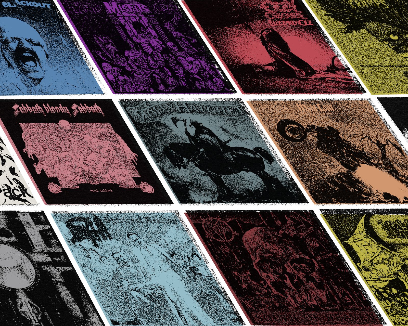
Heaviness has always existed within music. Beeethoven’s 5th Symphony is an undisputably heavy composition. The Blues trade in some very heavy subject material. It makes sense that this musical framework supports the basic structures of punk, hardcore, and metal.
In order to start establishing context for all of the new stuff that’s being made in 2026, we’re going to be digging down into the murky mines of heavy music visuals. There’s a cultural thread here which we will call the Brecht Effect. The concept inspired by a simple poem written by exiled playwright Berthold Brecht in 1939– heavy times indeed. The poem goes…
In the dark times, will there also be singing?
Yes, there will be singing.
About the dark times.
To start this journey, we’re going to jump back to the early 1970s. These were heavy times– the wave of post WWII material prosperity had crested, and the economic comedown was just getting started. This new decade brought stagflation, fuel crises, the retrenchment of hard right politics, and the continuation of the brutal war of attrition in Vietnam. Hey this is starting to sound familar. It’s not difficult to grasp how an economic and cultural climate like this can cultivate pervasive apathy, paranoia, and rage. We’re still singing about the dark times.
The following guide is intended to shed some light of some key figures so that you can start attaching names to these iconic visuals. We’re dropping some pins on a very large map with goal of triangulating a launching off point. Let’s get into it shall we?
Keith ‘Keef’ Macmillan
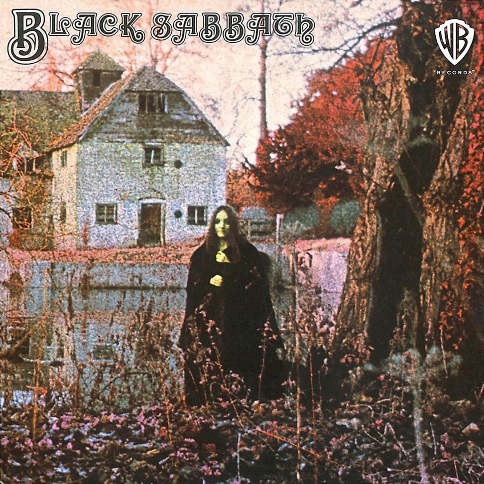
Recorded in late 1969 and released in 1970, Black Sabbath’s debut LP gave the world a much darker take on heavy blues. The scene on the cover let’s us know that this musical experience will haunt you. A pale faced figure gazes out at you like a cursed Mona Lisa. An idyllic, English mill-pond scene is twisted by colors that feel eerily out of space. The opening track delivers on the promise of fear. This was no loving trip of the 1960s, now fading into memory. Sabbath was here to soundtrack the hard comedown.
Their sound put down the creeping roots of metal, with album covers that are a design language unto themselves. Photographer and graphic designer Keith McMillan (aka Keef) was responsible for the visuals of Sabbath’s first album– as well as much of the iconic imagery that would follow, including Paranoid, Vol.4, and Master of Reality.
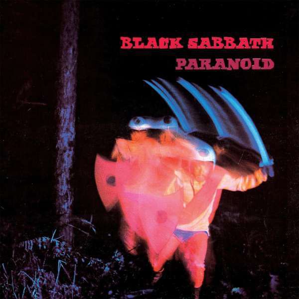
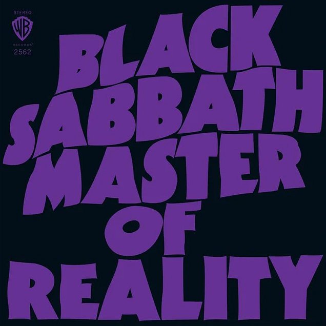
Macmillan’s graphic work still remains a visual touchstone for the Stoner and Doom Metal subgenres. The portal to heavy riffage was opened, shrouded by the heavy smoke of the sweet leaf. If you’re ever in need of inspiration, don’t be afraid to go back to where it all began.
Ed Repka
Before there was Adobe Photoshop, there was the airbrush. It was the only way to get smooth gradients and achieve near photorealistic effects with a physical medium. Like the film poster wizard Drew Struzan, it was also the tool of choice for the artist Ed Repka. It’s safe to a say that he may be the most prolific cover artist in heavy metal. His credits include bespoke covers for numerous Thrash and extreme metal bands, notably Megadeth– to which Repka’s style would be inextricably linked.
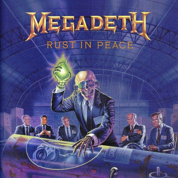
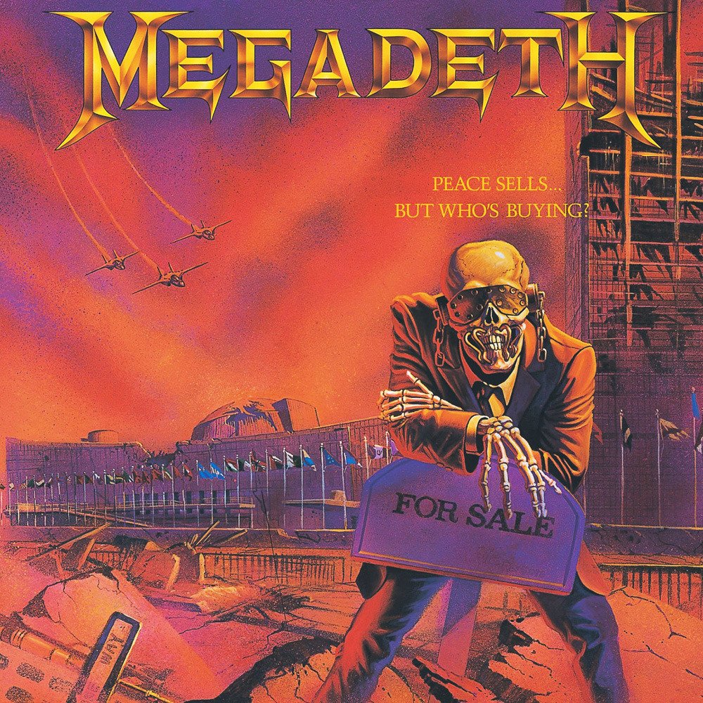
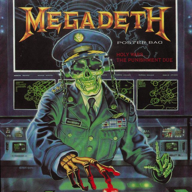
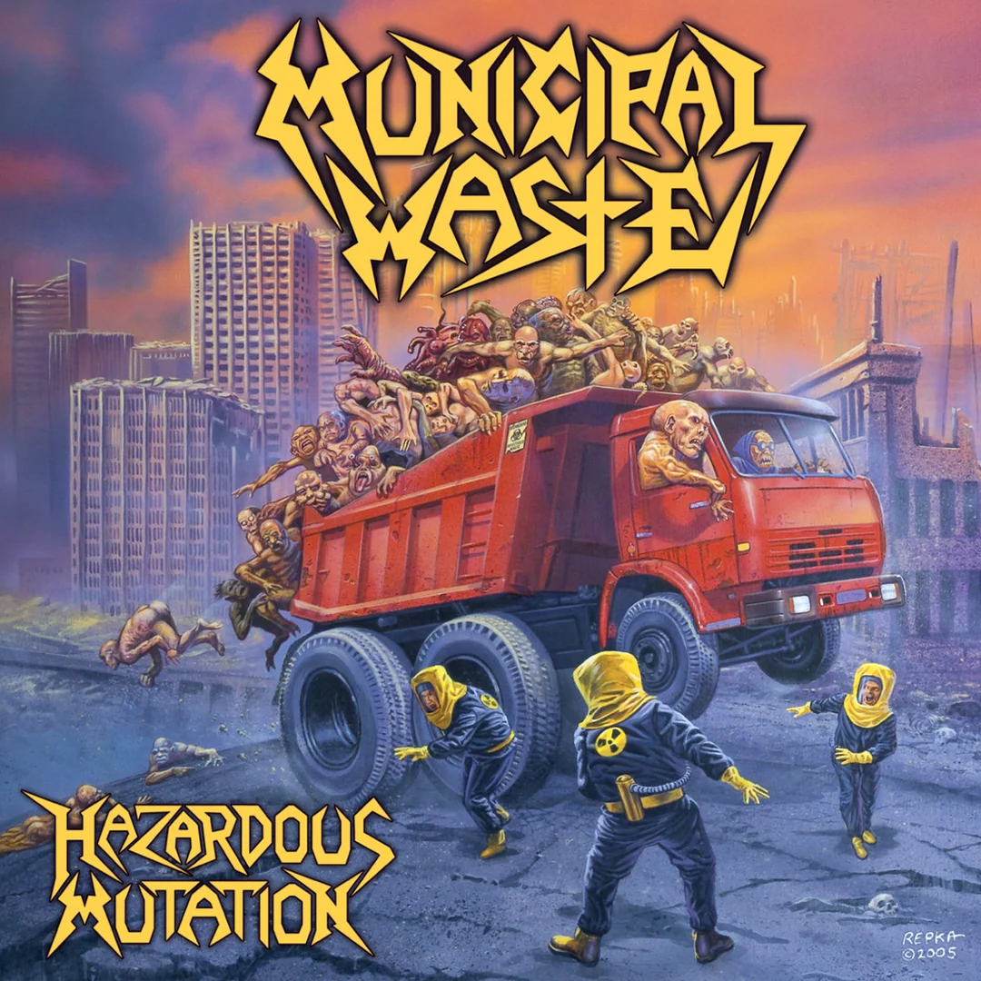
Born in 1960, Repka would’ve been around 26 years old when he was commissioned by Megadeath to create the cover for their second LP. These covers would expand the lore of ‘Vic Rattlehead’ beyond the adorned skull that was photographed for the cover of their debut record. Repka stayed true to his reputation as the King of Thrash, working with numerous bands through the eighties and nineties. He continued on through the thrash revival of the early aughts. Party Thrash heroes Municipal Waste even tapped him for their 2005 record Hazardous Mutation.
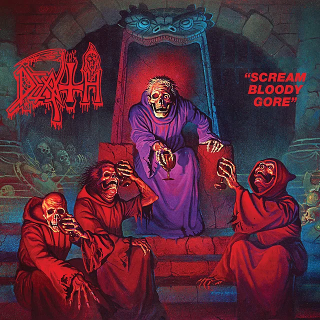
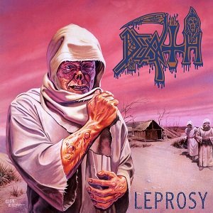
His tenure as Megadeth’s artist of choice inherently endears him to the realm of Thrash. His series of covers for Death’s first three LP’s grants Repka equal footing within death metal. With the first two covers, his subject matter shifts from Megadeth’s Cold War nightmares towards equally bone chilling fantasy scenes that feel right out of a Dungeons & Dragons campaign.
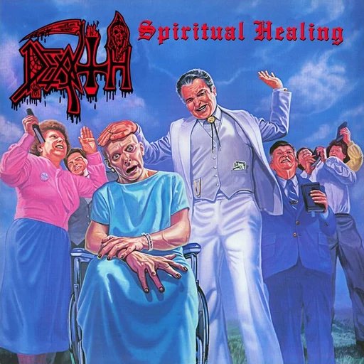
The cover for Death’s third album, Spiritual Healing, takes a different turn. We’re at an outdoor revival, a slick televangelist gestures theatrically at a visibly unsettled clinical patient. The sinister aura of the whole affair flips the notion of Satanic Panic on its head. These slick bastards are the real devil. It’s of little comfort to the captive patient, whose gaze seems to call out for help. Finally we realize we *are* the patient trapped in this casino masquerading as a Church.
Ed Repka continues his work to this day, staying active on social media and frequently appearing at horror conventions. He could even illustrate your next record cover, if your budget can support it.
Raymond Pettibon
Let’s deviate from the world of metal for a bit and enter the the lawless territory of punk and hardcore. Here, we find a figure that looms large over a crowd of largely untrained graphic talent. Raymond Pettibon gained initial recognition for his work with seminal hardcore band Black Flag. The iconic 4-bar wordmark that he designed for the group has gone on to become on of the most parodied (and tattooed) logos in music.
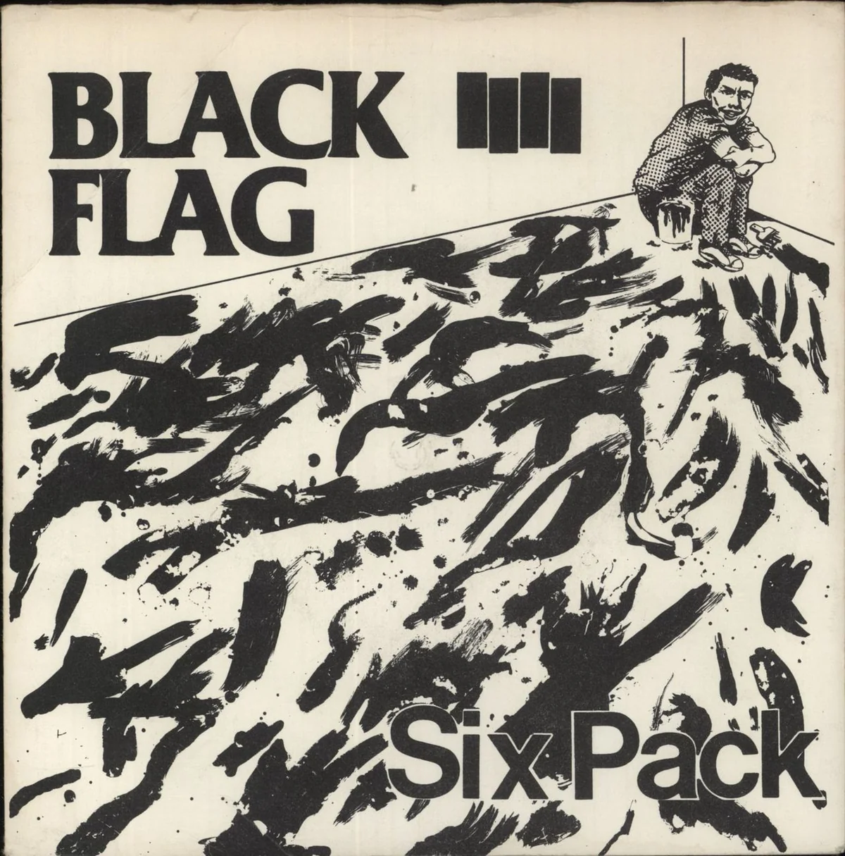
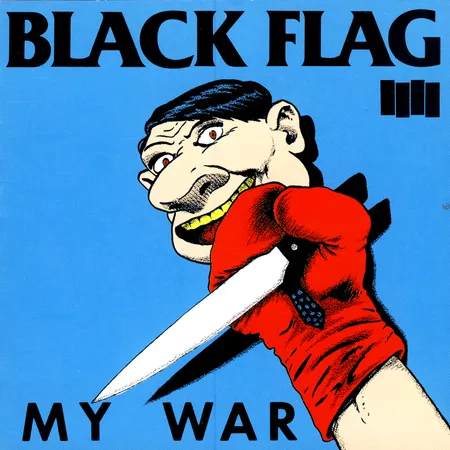
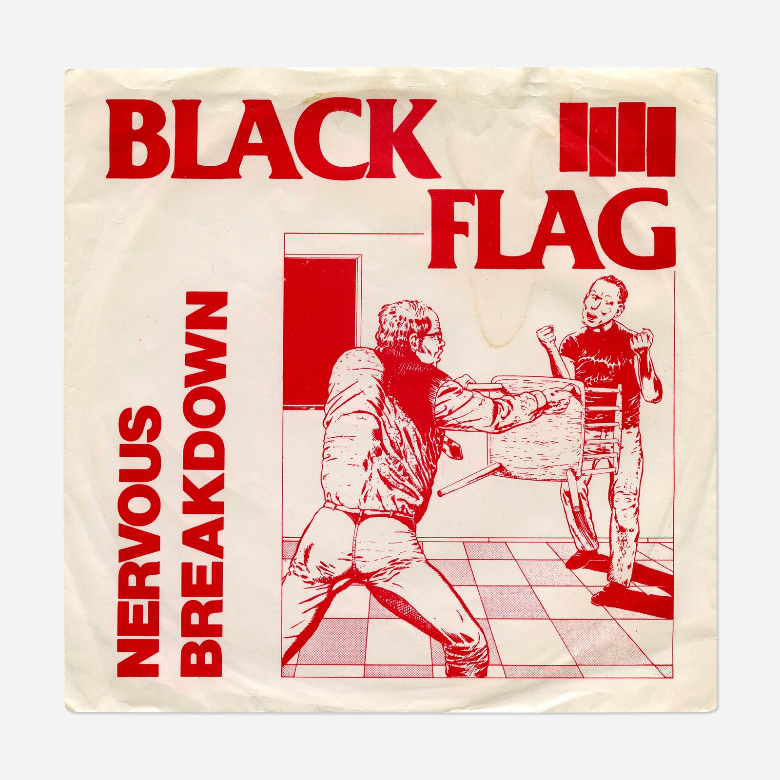
The world that Pettibon shows us feels as aggressive and menacing as the music contained within. Often depicting scenes of domestic violence and societal collapse, the artwork offends as much as it intrigues. The pace of punk has no time or budget for the meticulously rendered Hollywood-ready styles of Repka or Struzan. Pettibon hits us with aggressive brushstrokes and just enough detail to get the point across.
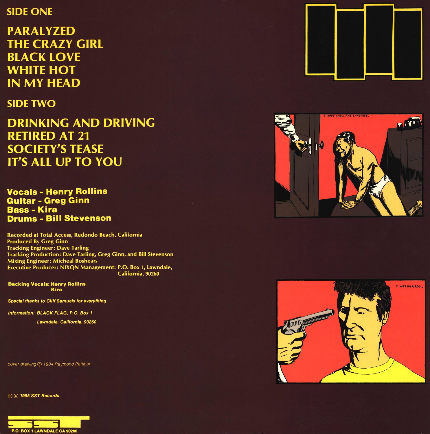
The underground comics style of the illustration conveys the feeling of a morbid cautionary tale. Like an unhinged Chick Tract, we’re shown the perils of straying from the straight and narrow path.
Pettibon continues to work in this style, but now as a museum-grade blue chip artist. His current work may be slightly less confrontational than the early stuff but he still exercises a keen eye for the tragicomic ephemerality of American existence.
Pushead
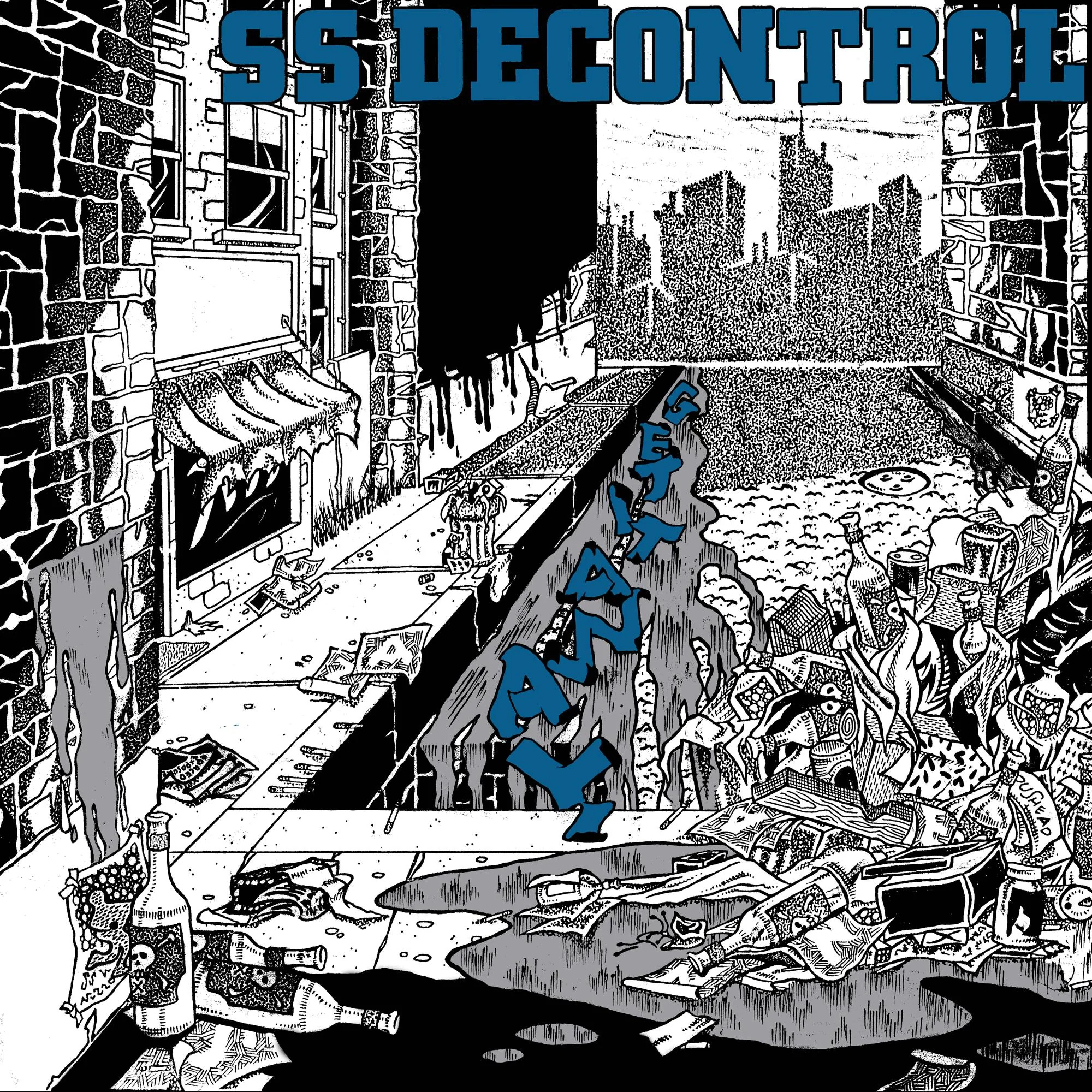
Pushead (pronounced puss-head) officially entered the fledgeling American hardcore scene as the cover artist for Boston hardcore band SS Decontrol’s sophomore record Get It Away. He had been corresponding with guitarist Al Barile. The band tapped him to conduct interviews and review their records. This eventually lead to the record cover gig. The black and white drawing features an early taste of what Pushead would go on to be known for within skateboarding and Thrash Metal.
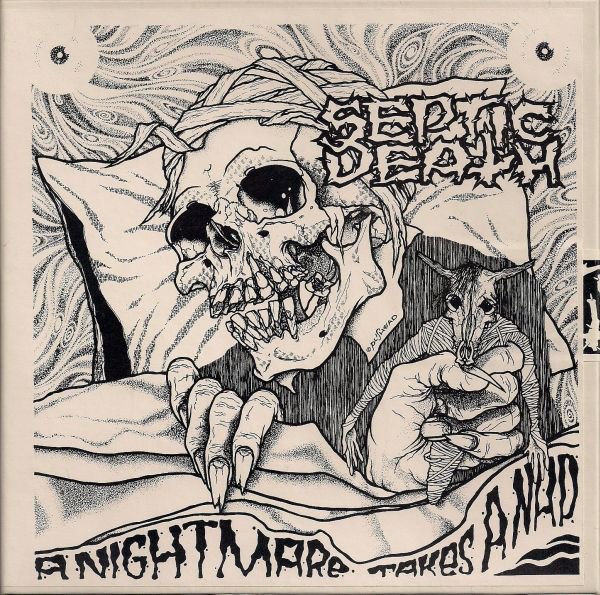
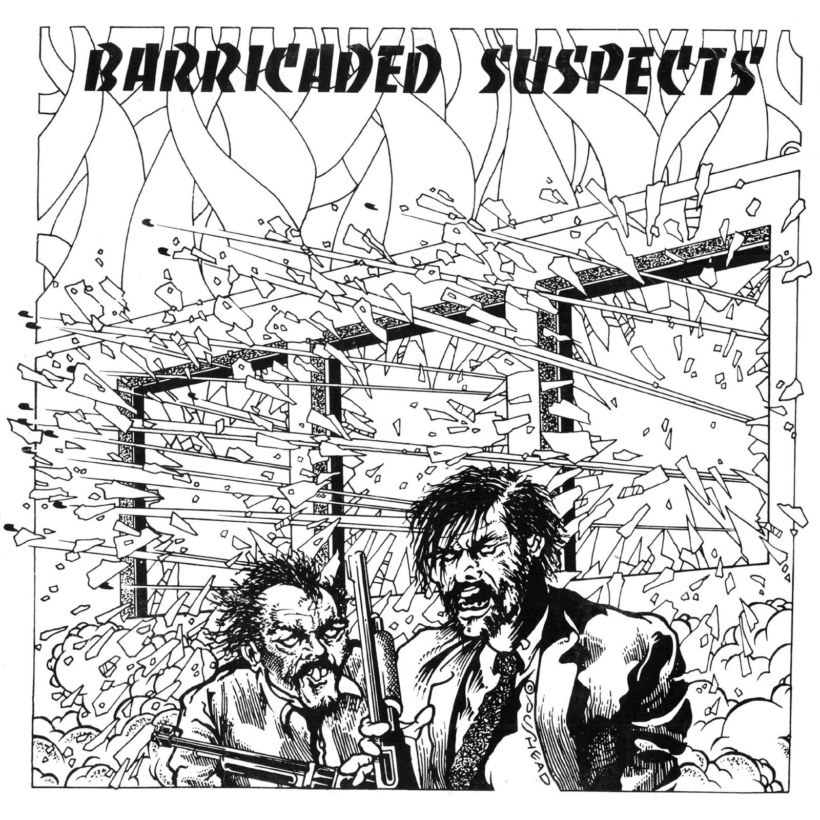
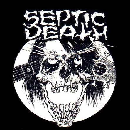
Pushead created almost all of the covers for the proto-grind hardcore band that he fronted, Septic Death. This is where we start to see his iconic, near anatomically accurate skulls enter the picture. His ghoulish contribution to the back cover of The Misfits’ Die Die My Darling EP would further anchor his hardcore credentials.
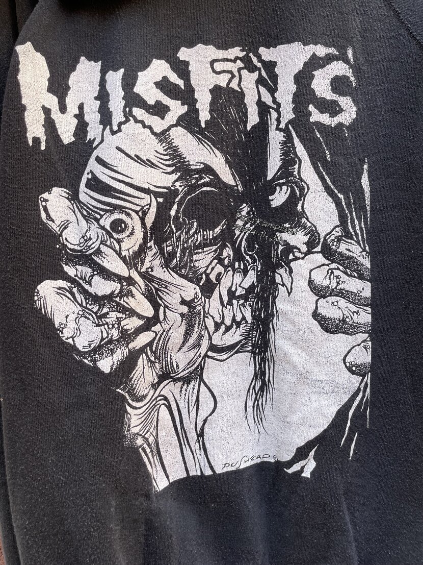
Pushead has roots in the early days of skateboarding, lurking and sometimes working at the legendary Del Mar Skate Ranch in California. Pushead would go on to be an integral contributor to early issues of Thrasher Magazine, as well as the artist in residence for Zorlac Skateboards. These graphics caught the attention of a couple of thrashers named James Hetfield and Kirk Hammett.
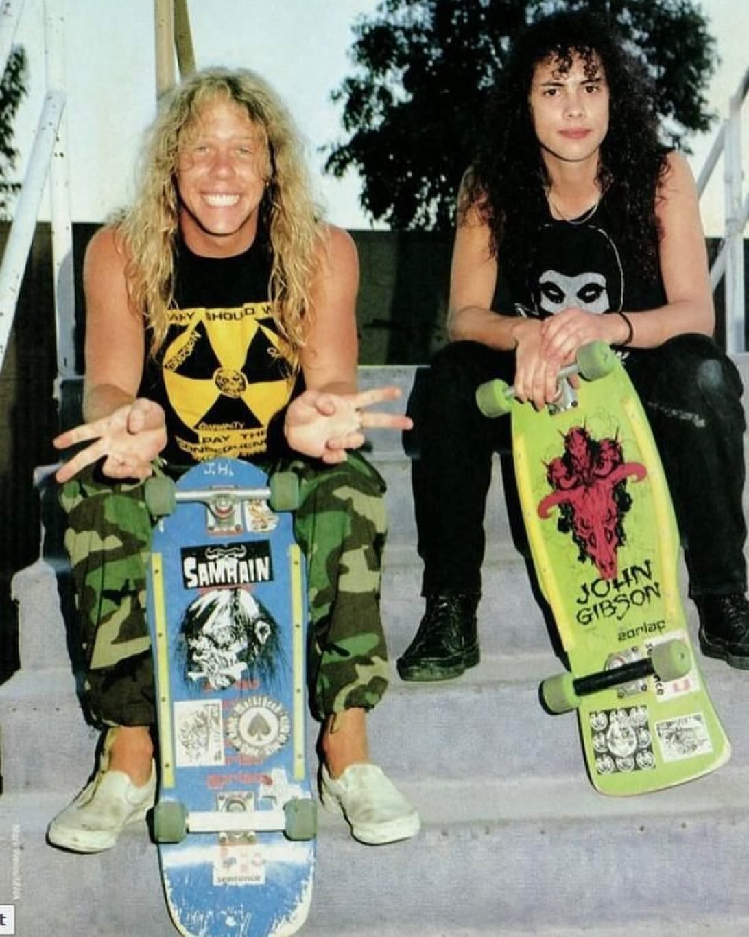
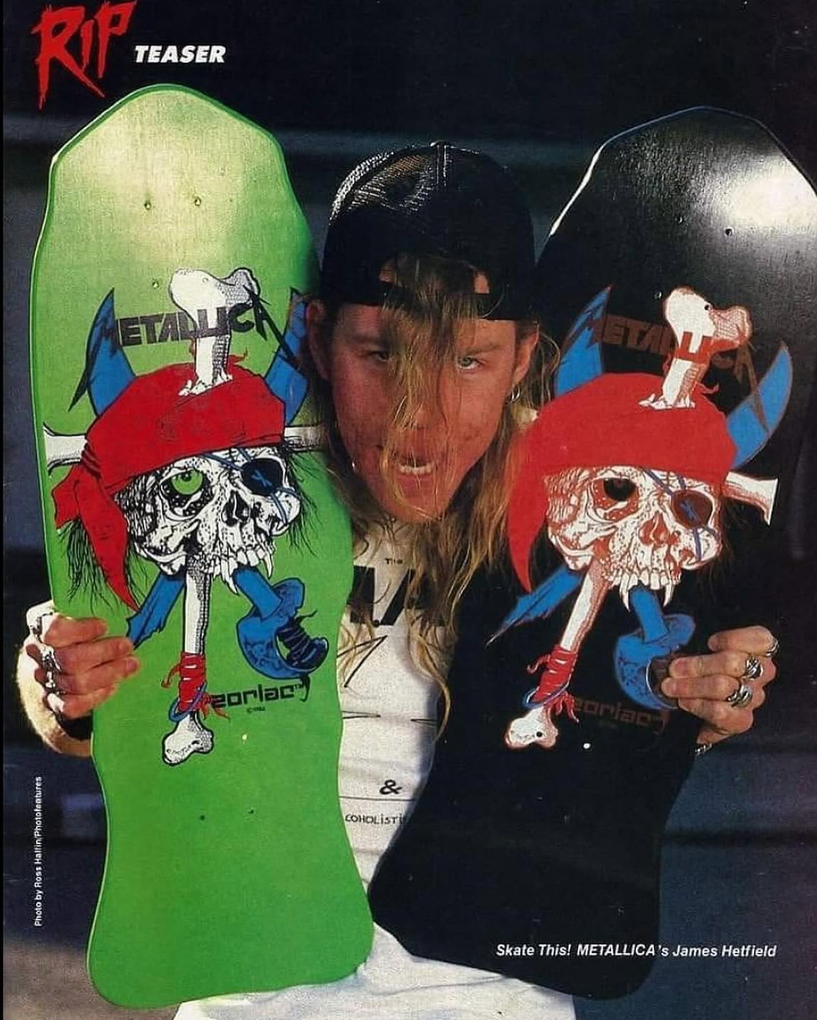
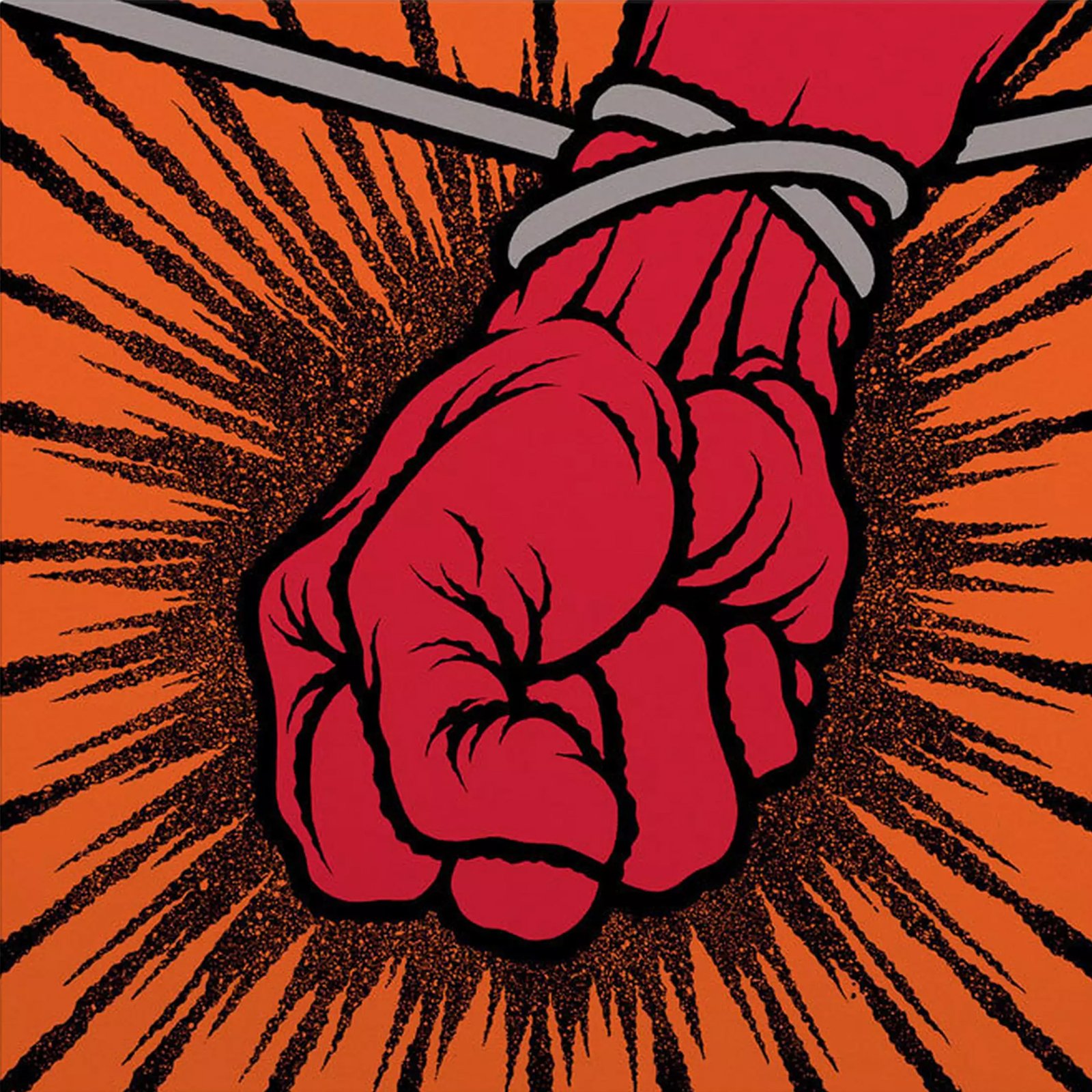
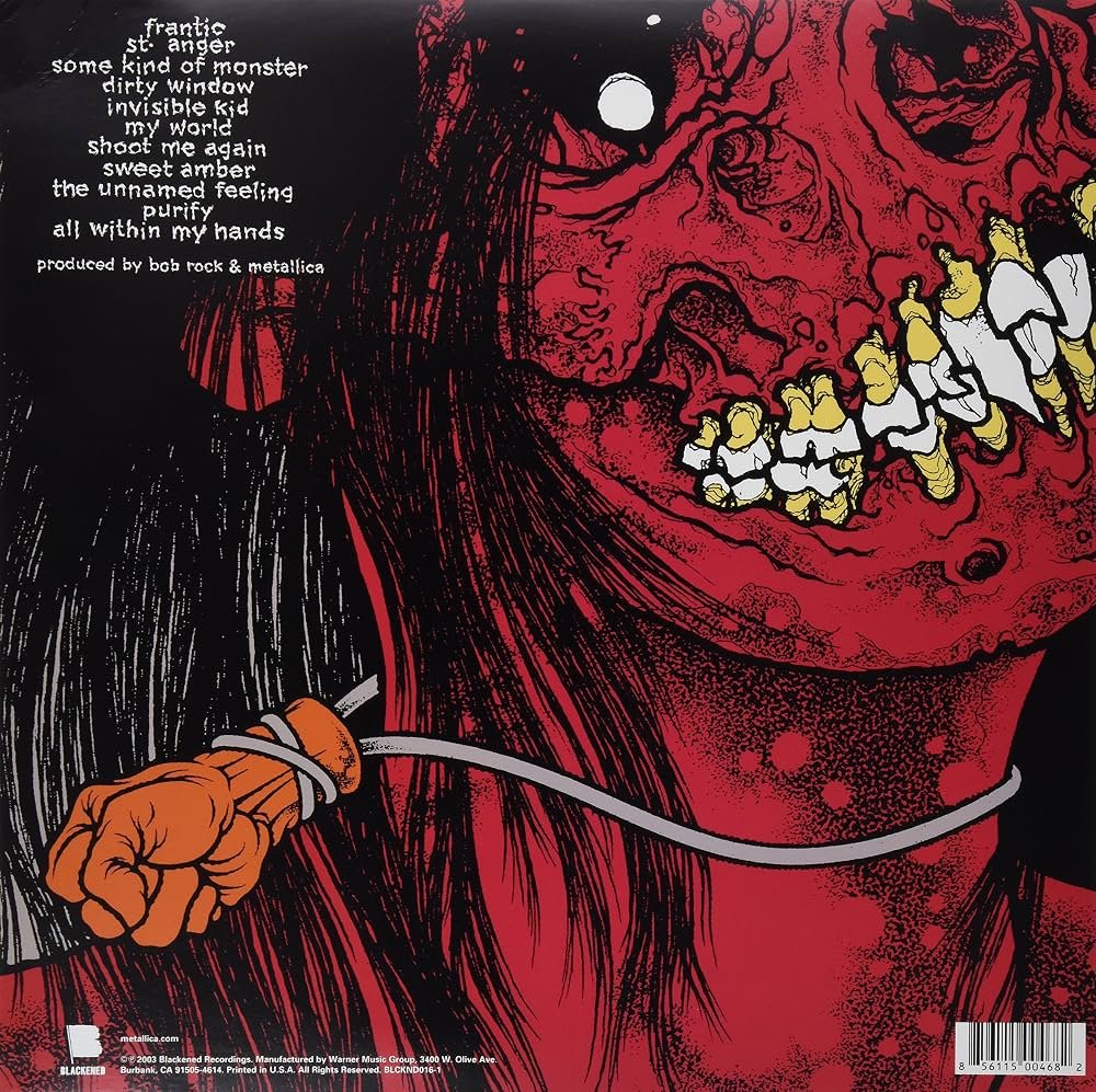
Initially working primarily on their merch graphics and a handful of singles, Pushead would finally be granted a full LP design with the 2003 release Saint Anger. Pushead’s work with Metallica really deserves a dedicated deep dive, and it will happen.
HR Giger
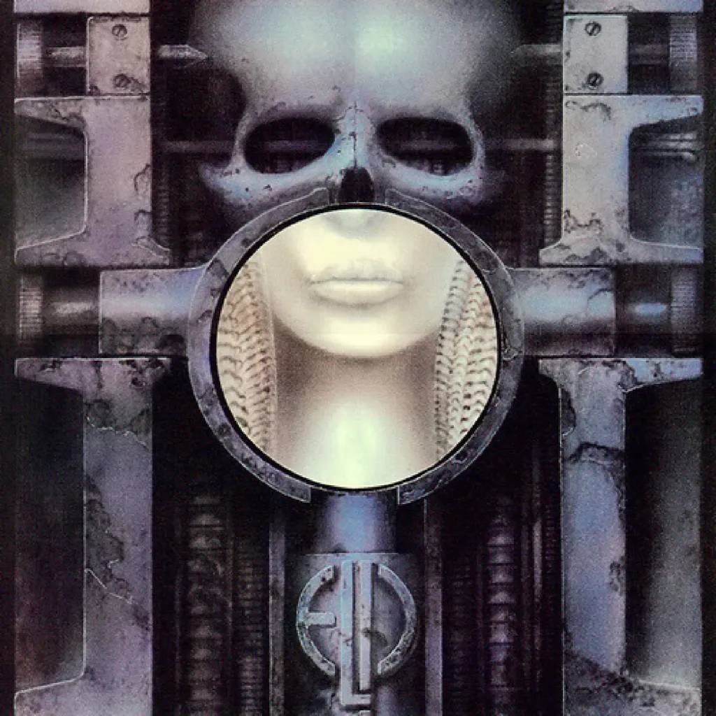
We come at last to an iconic painter who is arguably the godfather of heavy album art. The Swiss surrealists incredibly dark, techno-organic horrorscapes were destined to find a place within the world of Metal. His first cover design was for Krautrock band Walpurgis. However his signature style broke in widespread consciousness with Emerson, Lake & Palmer’s 1973 LP Brain Salad Surgery. Quoted in Rolling Stone, ELP’s keyboardist Keith Emerson noted- “We chose this artwork because it pushed album cover art to its extreme.”
Before he would go on to work with dark icons ranging from Glen Danzig to Jonathan Davis, he was collaborating with early punk and new wave icon Debbie Harry. His contribution photo-compositions for the cover of her solo debut KooKoo as well as for the single of the second single off the LP.
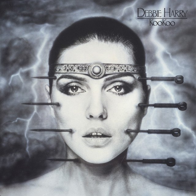
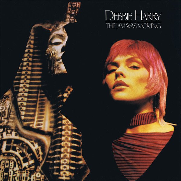
The concept is surprisingly dark for what is essentially a funk driven pop record. We see the pre-cenobite body horror of being pierced at multiple points down the face while Debbie’s seductive gaze remains unbroken. There are echoes of Marina Abramović’s Rhythm 0 performance piece, where the audience was invited to inflict either pleasure or pain upon the artist using an array of provided objects. Body horror would become one of Giger’s primary contributions to the canon of popular culture.
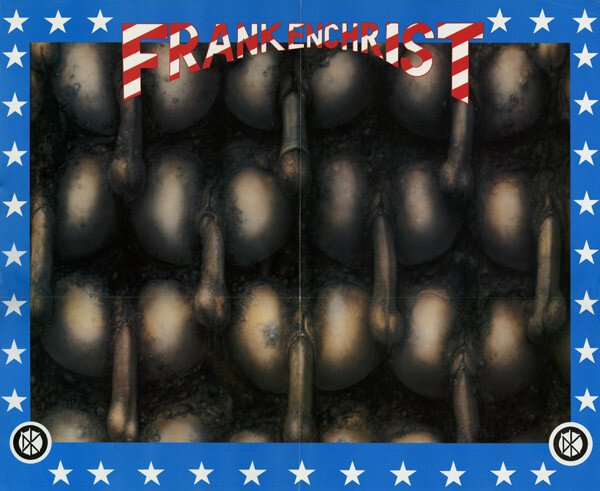
While we’re still in the punk realm, let’s talk about another of Gigers contributions to the culture– a *lot* of dicks. Giger’s aptly titled painting ‘Penis Landscape’ was included as a poster insert with the Dead Kennedy’s third LP Frankenchrist. The image would put Giger, the band and their label Alternative Tentacles in the crosshairs of law enforcement. A parent contacted authorities after a teenager bought the record for their younger brother, who then opened it in front of mom and dad. Lesson learned. The obscenity charges that followed would end up in mistrial– but it was an early sign of the censorship battles that were on the horizon. Subsequent pressings of the LP would exclude this bit of salacious ephemera.
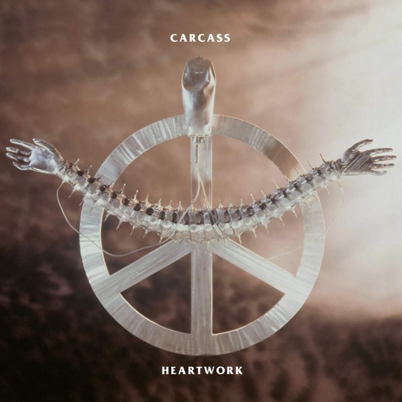
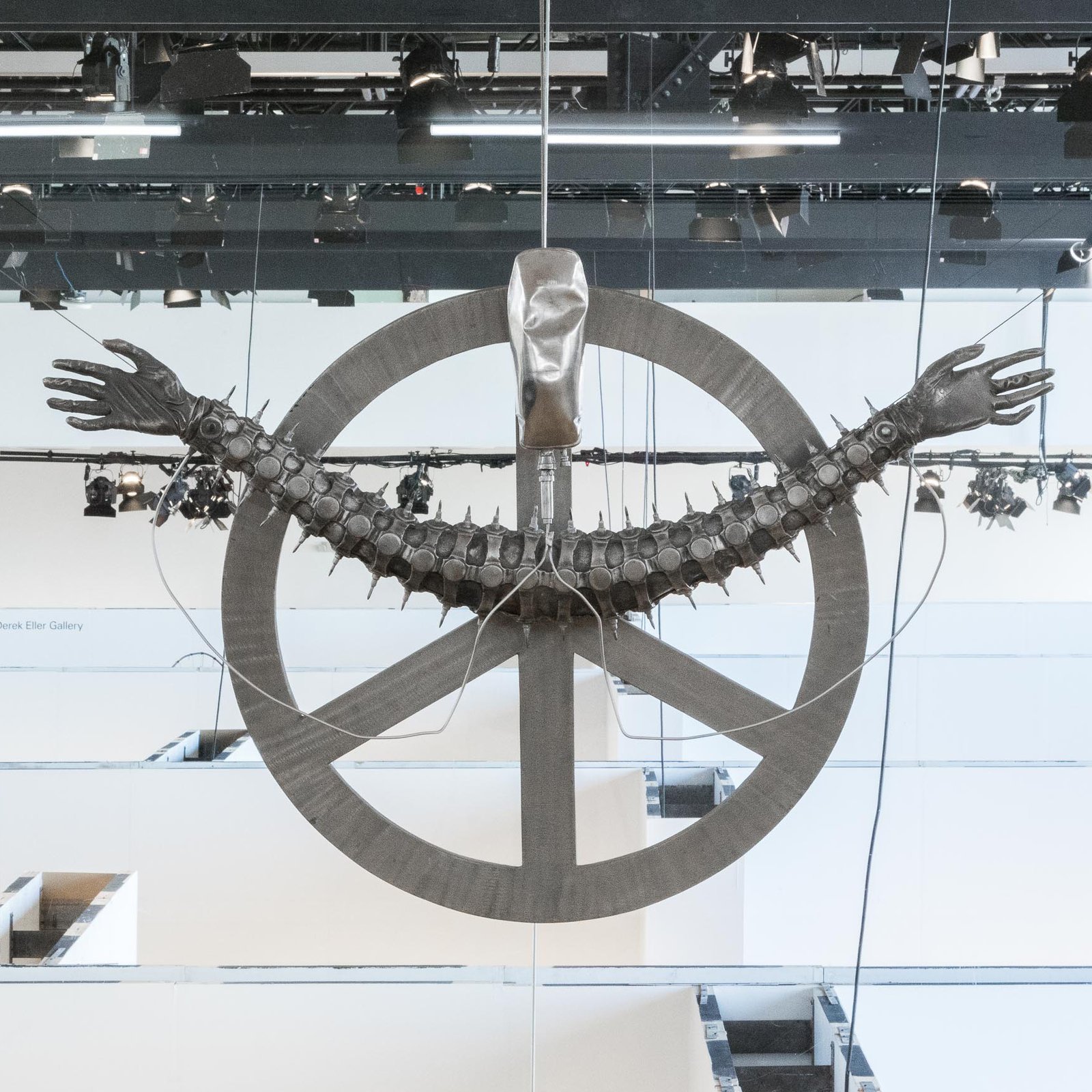
Trained as an industrial designer in Zurich, sculpture was a natural part of Giger’s repertoire. His sculpture ‘Life Support’ was photographed for the cover of the UK death metal band Carcass’ third LP Heartwork, which was released in 1993 on Earache records. The sculpture takes the form of a peace sign, supporting two outstretched hands, connected by a centipede like appendage. The gesture is reminiscent of a Roman Catholic crucifix. A metal cowling appears to have taken a bludgeoning, with two IVs drip feeding the hands below. It appears that this fixture needed replacing in the years since.
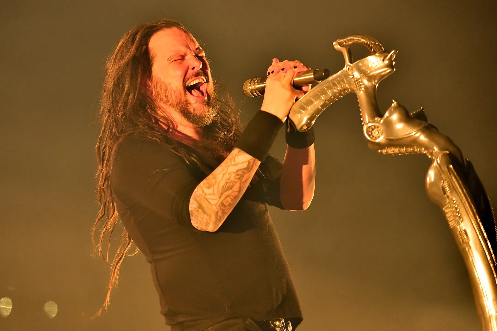
Giger would leave his mark on the burgeoning nü-metal subgenre when Korn’s Jonathan Davis requested a custom mic stand that was both “highly erotic and cybernetic”. She has become a vital part of Davis’ stage presence. With younger Gen Z and Gen Alpha’s adoption of nü-metal, the kids are inevitably being exposed to the seductive magnetism of Giger’s machine universe.
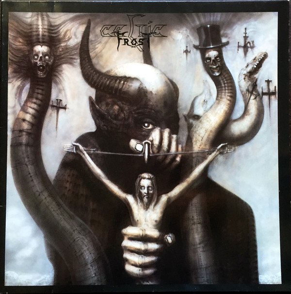
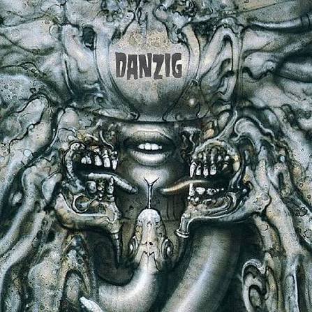
This is where we pull the metaphoric tour bus into the rest stop. It’s no great shock that Giger’s style would be most at home in the world of metal. Iconic covers here include the licensing of his painting ‘Satan I’ for the Swiss extreme metal group Celtic Frost’s 1985 LP To Mega Therion. New Jersey’s own Glen Danzig would utilize a close crop of Giger’s Meister und Margarita painting on the cover of his How the Gods Kill LP.
Outro
Remember this is only the beginning. There are key players that were passed over in the interest of keeping this post from getting too long. Future iterations of this series will be sure to include artists like Zdzisław Beksiński, Frank Frazetta, Vincent Locke, and Ken Kelly. Until then you’re welcome to ‘do your own research’ as the saying goes. Until next time, stay heavy friend.